Illustration by Min Gyo Chung
Can we talk?
When Bobby Axelrod on the hit show Billions went to an institutional investor to raise funds for Axe Capital, the investor brought up a problem: “My people have a few questions. Your Sharpe ratio’s very low.”
Real-life hedge fund managers can relate.
The Sharpe ratio is the asset management industry’s go-to statistic for summarizing achieved (or back-tested) performance. It is the most-cited reason to hire or fire individual money managers, in my experience as an allocator.
The relationship between risk and return is an essential concept in finance, and the ratio captures this in a single number by gauging how much return investors earned for each unit of risk:
Conceptually uncomplicated — the bigger the number, the better the risk-adjusted performance — it’s become an institutional episteme of success. Go to Google Finance, Bloomberg, Thomson Reuters, Morningstar, or any other provider of financial data, and you will find up-to-date Sharpe ratio rankings for virtually every mutual fund, hedge fund, trading strategy, and asset class. Professional marketers lug around pitchbook binders and prospectuses salted with Sharpe ratios because the industry is built around it. But the scary part is — cue the theremin — that the Sharpe ratio is the most misused financial statistic of all.

How Not to Do It
Most practitioners fail to understand that the Sharpe ratio is intended for one’s whole portfolio. Yet individuals and institutional investors have the bad habit of allocating as if high Sharpe ratios are all it takes to build strong client portfolios, piece by optimized piece. Goldman Sachs makes this exact mistake with its High Sharpe Ratio index, which goes by the elegant acronym GSTHSHRP, I kid you not. It’s a basket of equities selected by their individual Sharpe ratios — and Goldman should know better.Looking at the individual Sharpe ratios of managers or investments inside a portfolio doesn’t make sense. Write that down.
Axe Capital’s ratio should not help that institutional pitch target decide whether to invest because the million-dollar question is how Axe Cap fits together with the rest of the portfolio. Comparing Sharpe ratios in isolation is relatively meaningless because a fund with an itsy-bitsy one might increase the risk-adjusted return of the overall portfolio more than a fund with a high score if it has a sufficiently lower correlation to the rest of the holdings.
A combination of good Sharpe ratios doesn’t necessarily result in a portfolio with a good Sharpe ratio. On the contrary, strategies and asset classes that have performed well over a period likely share exposure to something in common. That’s the next important thing to remember.
How Can Everyone Get It So Wrong?
Sharpe ratios carry almost religious significance, despite so many ratio all-stars blowing up. Jack Bogle once said, “In terms of how the Sharpe ratio has done in evaluating mutual funds, I would say the answer is poorly.” Smart man, that Mr. Bogle.Many concentrated, technology-heavy funds like the Janus Twenty showed superior Sharpe ratios just before they plummeted in the first half of 2000. Long-Term Capital Management boasted a glowing 4.35 before it collapsed in 1998, nearly taking the financial system down with it. There’s a lesson here: The future isn’t what it used to be.
This metric was never intended as the end-all and be-all. It was meant to be quick and dirty. For example, if you are looking at an entire portfolio and have nothing else to go on and insist on only one number, it can be useful. A unidimensional risk measure will never tell the whole story. This is an opportune point to pause and remind ourselves that we have machines called computers now and can do so much more than this.
Sharper Sharpe Ratios
The main complaint against William Sharpe’s hallowed metric is that it treats all volatility the same, and volatility isn’t bad per se. By treating positive surprises in the same way as negative surprises, the ratio penalizes strategies that have upside volatility — i.e., big positive returns. Newer, tail-based measures like the Calmar ratio, the Sterling ratio, the Burke ratio, the Pain Index, and the Ulcer Index replace standard deviation in the denominator with a measure of drawdown performance. Drawdown can be measured in various ways — how deep, how long before recovery, the so-called volume between the breakeven line and the drawdown line — but they’re ultimately pretty similar. Others, like the Sortino and Omega ratios, throw away the positive returns and measure volatility only in the downward direction.Yet the quest for a better Sharpe ratio confounds experts because distinguishing between good and bad volatility isn’t as easy — or fruitful — as one may think. Constructing portfolios based solely on downside risk sounds like a revolutionary premise, but most investments have volatility that is more or less symmetrical. They result in rankings that are practically the same.
What’s true at the asset-class level is also true at the strategy level.
An article in The Journal of Portfolio Management’s special quant issue compared 3,168 different implementations of “value investing” and found that the wide range of portfolio construction choices (signal definition, weighting scheme, sector adjustment, rebalancing frequency, etc.) make an enormous difference: Cumulative returns ranged from negative 69.9 percent to positive 393.4 percent. The mind-boggling number of permutations and degrees of freedom in strategy design place risk and return combinations in different corners of an exceptionally voluminous cloud. In fact, the dispersion is so broad that the correlation among some value strategies is so low as to suggest they’re not one value family after all.
Here’s an interesting exercise: If you sort the 3,000-plus varietals into ten buckets by their Sharpe ratio and then again by Sortino ratio, very little changes. The drawdown characteristics are related in a near-linear manner to the Sharpe ratios. To quote Bill Murray, “It just doesn’t matter.”
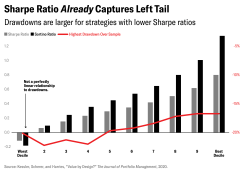
In fact, maximum drawdown and attempts to create tail-risk ratios are simply noisier measures than the original because they rely on fewer observations to determine their values. Further, the Sharpe ratio builds on a sound theoretical framework, so there are a wide range of statistical tests available for it, which cannot be said for many of these new measures. Viewed as a t-statistic, you can test hypotheses with the ratio, get a handle on estimation error, and precisely quantify whether a manager was good or just lucky.
This whole debate centers on what to use as a measure of risk, but William Sharpe never claimed it should be volatility. The Sharpe ratio was originally called “reward-to-variability” because volatility is not an identity for, nor an analogy to, risk. In 2007, volatility measures would have told you that U.S. equity funds had never been safer, on a risk-adjusted basis.
Sharpe’s famous paper addressed expected returns, but his metric’s near-universal application has been to historical returns — i.e., which manager was better over a time span. He never designed it to certify the future performance of investments. Past Sharpe ratios are not indicative of future Sharpe ratios and — given the time-varying nature of asset class and risk premia — should never be taken as a precise measure of anything.
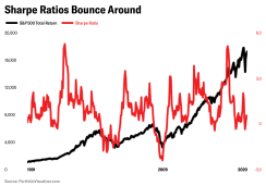
Modern portfolio theory can be blamed for ingraining the goal of maximizing expected return for a given level of risk. Today, everybody promotes the Sharpe ratios of their funds in their marketing, but high risk-adjusted returns don’t guarantee good, or safe, results because Sharpe ratios go up and down. One might be cautious of the sterling Sharpe scores, or even wonder if high Sharpe ratios are predictive of blow-ups. It was the funds with impeccable track records that went bust during the 2008–09 rout. The more stable the return, the more likely there’s a big loss ahead? Volatile funds lose money — but not as much as non-volatile ones. For example, six months before hedge fund Malachite Capital Management’s spectacular failure, consultants were recommending it as a “diversifying strategy.” Malachite’s extremely attractive Sharpe (around 1.2) made it easy to sell, but certainly did not capture the fund’s true risk.
Bad Math
No investment group consistently boasts louder about its impressive Sharpe ratios than hedge funds, but the most commonly used method to calculate a strategy's Sharpe ratio misstates the true investment risk. It’s easy to understand and easy to calculate . . . incorrectly. All of the large hedge fund indexes (Hedge Fund Research, Morningstar, Credit Suisse, Eurekahedge, and BarclayHedge), consultants (Preqin, Albourne, Cambridge Associates, Aksia), and managers compute it the same way, but such Sharpe ratios are routinely overstated by as much as 70 percent.The financial community is accustomed to estimating annual standard deviation by annualizing the monthly standard deviation. These are not the same. The formula of multiplying monthly estimates by the square root of time traces to Albert Einstein in 1905, but is inapplicable in situations with serial correlation — for example, when one month of positive returns tends to be followed by another. Careful readers will recall that Sharpe pointed this out on page 49 of the fall 1994 issue of The Journal of Portfolio Management.
Annualized standard deviation overstates a Sharpe ratio by as much as 65 percent. Properly computed using a private database, Malachite Capital’s standard deviation was 78 percent higher than presented and its Sharpe ratio 44 percent lower.
Annualizing monthly returns makes sense if you don’t have much data, but in many cases you can compute the real standard deviation using annual quantities. The HFRI Fund of Funds Composite Index and the Credit Suisse Broad Hedge Fund Index are the dominant providers of asset-weighted hedge fund data extending back to the early 1990s, and publicize lifetime Sharpe ratios of 0.81 and 0.80, respectively, through December 2019. But one can easily calculate the actual measured standard deviations of annual returns, which are significantly higher than the annualized monthly standard deviations calculated by HFRI and Credit Suisse. Correcting the statistical illusion drops their Sharpe ratios down to 0.45 and 0.52.
The Tyranny of Metrics
It’s not the ratio that has a problem. It’s us.Some might say we are trying to quantify the unquantifiable, but there’s more than that. The salience and ideology of metrics has a flaw known as Goodhart’s Law: When a measure becomes a target, it ceases to be a good measure. The more any quantitative indicator is used for decision-making, the more it becomes subject to corruption and apt to distort the processes it is intended to monitor. Metric fixation invites gaming. Investment firms that manipulate their products to engineer a favorable Sharpe statistic are akin to teachers who juke the stats by teaching to the test. Similarly, the returns reported by private-equity firms can be skewed to the extent that managers have used subscription credit lines to improve their internal rates of return. The IRR metric itself isn’t flawed; we’re flawed.
The Sharpe ratio has changed investor behavior. We chase the metric rather than the underlying quality it is trying to assess. Drawn like Dostoevsky’s Raskolnikov to the flame, we can’t resist a good-looking Sharpe ratio, despite knowing that past average experience may be a terrible predictor of future performance. Investors have begun to manipulate their Sharpe ratio — and their value-at-risk — by loading up on asymmetric risk positions.
Strategies that generate slow, steady profits punctuated by periods of sharp losses are in vogue right now across a range of asset classes. As bond yields have tumbled since the financial crisis, investors have looked for ways to increase returns. Shorting volatility has become an alternative to fixed income. The yield earned on an explicit short volatility position competes favorably with most sovereign and corporate debt.
Selling stock-market volatility — insuring others against market moves — has been a consistent moneymaker. Carry trades like this deliver stable premiums each year with no apparent increase in volatility, until the big disaster you’ve been writing insurance against materializes. The infrequency of losses increases the perceived “moneyness” of the strategy. But when losses do occur, they tend to quickly spiral into giant, brutal wounds.
Some recent examples are reminiscent of Long-Term Capital Management, whose short gamma strategy worked until it did not. These strategies are vulnerable to surprise events that elude most methodologies — even complex ones — for measuring risk. Like selling a credit-default swap, the chance of ever having to pay off is so minuscule, falling outside the 99 percent probability range, that it disappears in the value-at-risk figure.
With the Sharpe ratio as yardstick, put-selling strategies look great compared to the S&P 500 because the premiums translate into immediate risk-adjusted alpha. Many retirement systems and nonprofits reaped years of steady returns by selling short-term risk insurance (aka “harnessing volatility premia”). Viewed in that context, bandwagoning into high Sharpe tailgating strategies that are certain to eventually blow up makes all the sense in the world. To paraphrase Anchorman: 99 percent of the time, it works every time.
Key to deceiving the Sharpe ratio is optionality, the price of which is almost entirely determined by volatility. So it can be said that optionality is volatility, and volatility is optionality. And volatility hatched a multibillion-dollar business betting on volatility itself; morphing into a giant casino of its own. It has become a central obsession of the markets. The number of instruments and risk-recycling strategies making bets on movement can only be described as extraordinary, and this giant trading ecosystem can magnify losses when turbulence hits. The violence of vol has never been greater: Of the ten largest all-time highest VIX closes, five of them occurred in March.
Naively buying product for its shiny Sharpe ratio can be diametrically incorrect, warping institutions to favor strategies with the largest positive serial correlation and, therefore, the most hidden risk. Strategies with asymmetric, highly skewed, dynamic distributional features potentially sucker investors into taking on frightening amounts of unknown risk. Big plans may be engaging in a negative selection process that gravitates toward managers whose strategies imply a catastrophic loss of capital. As Alberta, Canada’s public investment arm recently learned, it’s not very hard to lose a couple of billion selling volatility. That’s upward of C$480 ($363) per woman, man, and child in the province; but who’s counting? It seemed so safe. The Sharpe ratio was amazing. Until . . . kaboom. This is the opposite of Moneyball.
Allocation decisions involving hundreds of billions of dollars and affecting millions of individuals hinge on the Sharpe ratio, but — if I may adopt a paternal tone here once again — it has become a crutch for many investors. Asset allocators accustomed to comparing annualized Sharpe ratios across asset classes should be especially wary of the practical relevance of such comparisons. A manager with an amazing-looking Sharpe ratio is guaranteed to get a close look from institutional investors. That shiny stat cannot replace a basic understanding of the return-generating processes of the underlying strategies.
A high Sharpe ratio is a simulacrum of success. Yet what gets measured may have no relationship to what we really want to know.
We have become the tool of our tool.
Richard Wiggins served in a senior strategy and risk position at Saudi Aramco’s pension fund from 2012 until recently, when he returned to North America.