By Erik Norland, CME Group
AT A GLANCE
- For the past 30 years, implied volatility and yield curves have been locked in a repeating cycle
- S&P 500 options volatility appears to alternate between high and low volatility regimes
Implied volatility on S&P 500 options has been exceptionally low recently. But is that about to change?
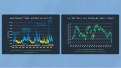
When looking at the implied volatility on S&P 500 options and the slope of the yield curve side-by-side, there doesn’t seem to be an obvious relationship.
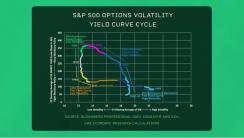
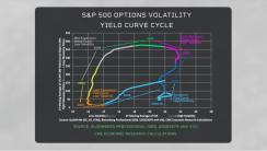
However, when taking the two-year moving averages of implied volatility and the yield curve shape, a pattern that has been repeating for over three decades emerges.
For example, in the United States in the early 1990s, a flat yield curve reflected tight monetary policy and high volatility in the equity market. This coincided with the 1990-91 recession. As a result of the downturn, the Federal Reserve lowered rates, and the yield curve steepened. By 1994, the U.S. had a steep yield curve, and implied volatility had fallen to low levels. So, the Fed raised rates, flattening the yield curve in 1994 and 1995. Initially, implied volatility didn’t rise, but by 1997 it began an uptrend that culminated with the 2001 tech wreck recession.
The Fed again eased policy in 2001 and 2002, which steepened the yield curve and reduced implied volatility on equity options. By 2004, with a recovering economy, the Fed began to tighten again, which flattened the yield curve and ultimately translated into the wave of volatility that accompanied the Global Financial Crisis.
The cycle repeated between 2008 and 2020. Currently, the yield curve is steeply inverted. If history is a guide, today’s tight monetary policy might translate into a wave of volatility in coming years.
Learn more about CME Group