The New Zealand Superannuation Fund’s 2011/12 annual report is out this week. And, given that this sovereign fund is one of the most sophisticated in the world, I tend to read this annual report cover-to-cover. Here are some of the more interesting graphics.
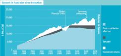
1) Apart from the financial crisis, the fund seems to have had some solid returns over the past decade. But what's particularly interesting about this graphic is to see how important taxes are for this fund. The tax status of investments must be a big consideration...
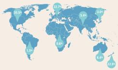
2) I thought it interesting to see the geographic distribution of assets, as the fund is clearly overweight NZ and North America and underweight Europe and Asia. As for Europe, that's obvious. As for Asia, that's likely to do with difficulties finding suitable access points...
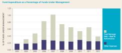
3) The fund has also been very frugal, keeping external manager compensation far lower than some of its peers (especially in the United States). And, I'd argue, this is a result of its in-house capabilities, which are quite strong...

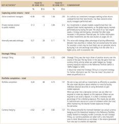
4) This graphic offers a break down of where the NZSF adds value above and beyond its benchmark reference portfolio. And it looks to me like strategic tilting is the biggest internal generator of active returns. And that's probably wise given the resource constraints of a fund like this one...