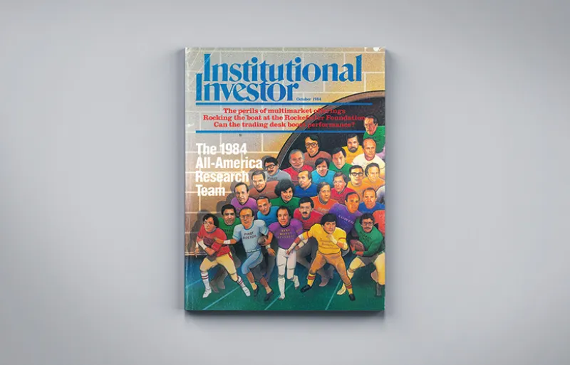
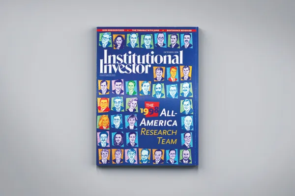
A deeper dive into the iconic football aesthetic of II’s most enduring ranking — and why you don’t see it anymore. For the full background story, see:
"The Plot to Overthrow the All-America Research Team"
Mike Brent, hired in 1970 as an II assistant art director, created the 1972 magazine cover for the first All-America Research Team, and the look that’s still synonymous with AART. Brent took the football theme and ran with it, sketching the iconic illustration of shoulder-padded, jerseyed analysts that was the October cover template (with one exception) for 28 years.
When Brent left in 1976, Chel Dong took over and saw it through to 1996.
“The process was arduous,” Dong remembers, now “happily retired and deadline-free.” “We had to gather all the names of the first-teamers and chase them down for a photograph and never let them know why.” While the department built a photo file over time, new winners and category shifts required additional headshots every year. The first team expanded from 26 members in 1972 to 60 in 1981 and to 80 in 1991. “We burned through qualified illustrators who could execute such complex covers,” Dong says. “After a while we couldn’t even include a background — just the heads, to make them all fit.”
When an analyst changed firms or quit before the magazine went to press, Dong and his team had to redo the cover. “We bought X-Acto knives by the case,” he recalls.
To celebrate the 25th anniversary of the AART in 1996, II arranged for a group photo. Analysts had the choice to show up at one of two time slots for their shoot, and the art department used Photoshop — then a novel tool — to concatenate the two photos. “If you look closely, you can see where the split is,” Dong contends.
By 1999, ascending editor Michael Carroll had made up his mind to jettison the hand-drawn cover and the football theme, but let Brent’s aesthetic continue one final year. A new art director, Irene Ledwith, made her mark with the 2000 issue: A spray-painted gold football placed it at the top of the first page of the article, as if kicked by black-tie-outfitted analyst Gregory Cappelli of Credit Suisse. (Cappelli, who covered education companies, is now CEO of Apollo Education Group, parent company of the University of Phoenix and a giant in the for-profit college industry. His Milken Institute speaker bio notes his place on the AART.)
Photography presented its own challenges for the art team. Ledwith lauds former Photo Editor Anastasia Pleasant, whose early experience taking pictures of children helped her coax smiles out of somber analysts. Some analysts developed reputations around the II office for caring deeply about their photos. Former Managing Editor David Schutt recalls receiving a “stop the presses” call from a PR rep. “We sent the wrong analyst’s photo,” the rep claimed, and offered to cover the cost of reprinting the magazine. The “correct” photo arrived at the II office, and was virtually the same as the one in the layout.
Other analysts were more sanguine. “I don’t care if a wart shows up on my nose in the picture,” Ledwith remembers being told. “I just want to be on this list.”


