Perhaps you’ve heard: I’m co-conceptualizing and redesignengineering a new company called ‘KickCrowdBox’. It’ll be a sort of ‘Big Data FinTech Platform’ that offers every analytic tool investors could every want or need... plus it’ll have a dash of CRM, mobile payments and, while I’m at it, 3D printing (easy to do actually). It’s going to be huge. (Note: For any VCs who want to co-pathbreak and co-re-envision with me, I’m raising $25 million on an uncapped note, so please send all enquiries here.)
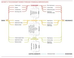
But I’m not writing this blog post to plug my new... and for the humorless among you, fake... company. Rather I want to highlight a really great chart I recently came across by the good folks over at Oliver Wyman. I love it.
In fact, all kidding aside, I think this graphic offers a view into the future of finance and highlights where Silicon Valley can help (or even disrupt) the ‘mainstream finance’ world. As I see it, each one of the lines in this figure is a type of data that must be collected, vetted, cleansed, managed, packaged, analyzed and presented... no easy job for a lumbering financial services firm.
Enter KickCrowdBox ... (And if the graphic below is too small, click here.)